Find brand clarity & direction with a moodboard
Moodboards can be a powerful tool for all creators. They can help shape the visual direction of a project or publication, offer a sense of clarity, and focus your creative vision.
Hi,
Welcome to the third part of our branding series with Sarah Robertson, the designer, mentor, and writer behind the Brand Seasons publication. Here are the first two parts if you need to catch up.
Just this week, Sarah launched a Kickstarter campaign to fund the Brand Seasons Playdeck, a pocket-sized card deck full of branding wisdom and guidance featuring 48 prompts to support you with strategy, styling and storytelling.
In her first piece for The Author Stack, Sarah shared her approach to branding with purpose—definitely worth a read if you’re building a business or publication. She then talked us through the process of creating an intuitive brand strategy. Today, we’re stepping into styling and crafting a moodboard.
We’ve already laid the groundwork with strategy, but now it’s time to dive into styling, focusing on one of the most exciting parts of the process: moodboarding!
This is where things get interesting because a moodboard is your brand’s playground, where you get to experiment with how your writing should feel. Think of it as a visual Pinterest party, and you're the host.
Moodboards can be a powerful tool for all creators. Not only can they help shape the visual direction of a project or publication, offering a sense of clarity, but they can also help you find your aesthetic. It's about crafting the look and feel of all the key elements we’ve explored in earlier posts—such as foundations, positioning, and essence—in a tangible, inspiring and cohesive way.
The magic of moodboarding
When writing about brand styling, I’m referring to designing a brand identity, specifically logo design, colour palette, and typography. However, before diving into these elements, I begin with a moodboard for a broader, more explorative approach.
It acts as a visual compass, guiding you through the design process, and it can be a joyful way to explore how your brand essence, capturing the textures, imagery, and colours that best represent your identity. For writers, moodboards are especially useful for evoking the right atmosphere for your work—whether it’s the cover design for your latest book or the overall aesthetic of your author website.
This allows us to play before we plan. To consider styling through a wider lens before delving into the details. Think of it like doodling before you make the masterpiece—have fun and see what sticks!
Examples of moodboards
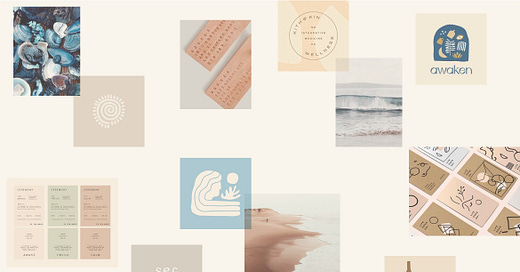
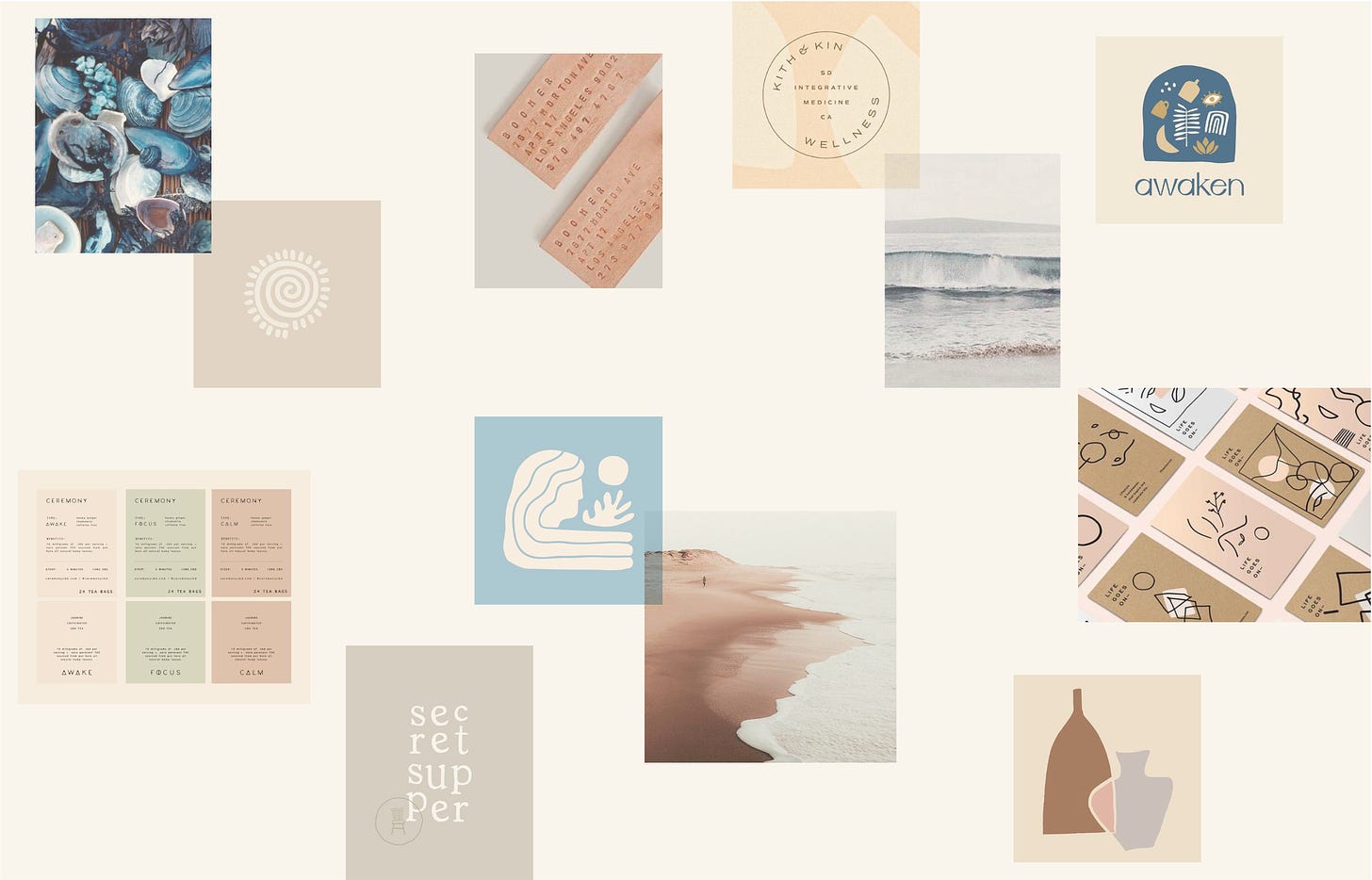
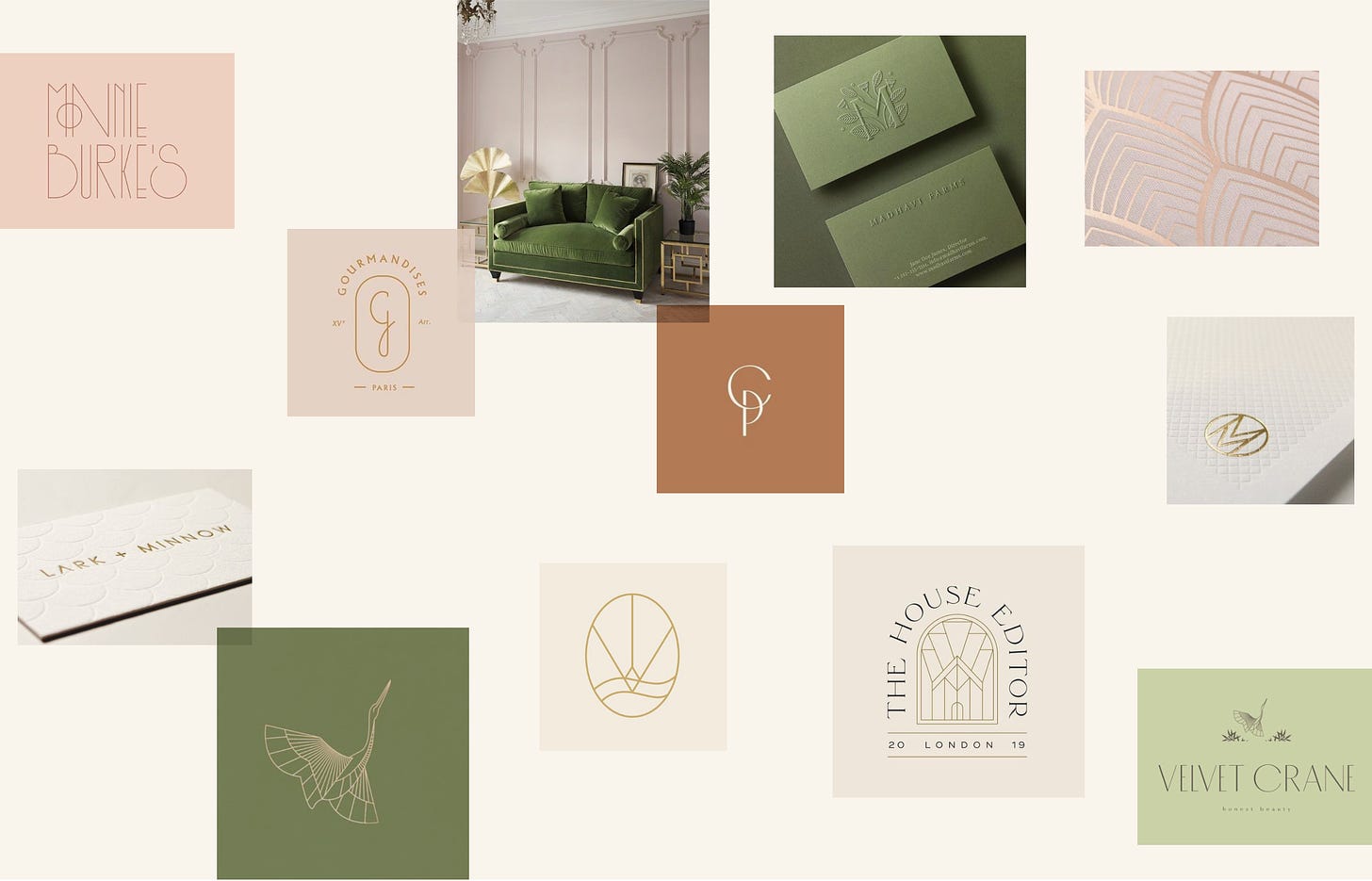
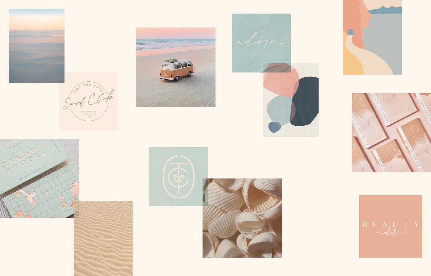
Here are a few moodboards I’ve developed for a range of clients. Each reflects a distinct style and purpose, and I hope they inspire how you might approach your brand creation:
The Mindful Potter
This moodboard is a nod to the beauty of ceramics, featuring natural textures and earthy tones. It was produced for a pottery brand, but writers working in mindfulness, nature writing, or even self-help could feel right at home here. Muted colours, organic shapes, and tactile elements help convey peace and connection to the outdoors.
Studio Nikogwendo
This brand draws heavily on Art Deco influences, using geometric shapes and a refined, elegant palette. Writers working in literary fiction, historical narratives, or genres with a sophisticated tone could reflect on this style for inspiration. The moodboard combines sharp lines and symmetry with luxurious touches.
Kind & Conscious
Designed for a lifestyle brand situated by the stunning coast of Cornwall, this moodboard captures the character of the ocean through soft watercolour washes, handwritten fonts, and wave-like patterns. Does your writing touch on nature, wellness, or personal growth? Then this might resonate.
How to curate your moodboard
Ready to begin? Here’s how to get moving. And remember, you can approach the process in a way that feels good; make your favourite drink, tune into your favourite playlist, and then begin:
Begin with inspiration: Start by collecting inspiration on a platform like Pinterest or use a similar tool. You could even go analogue with magazines, scissors and glue! Think about how you want your writing brand to feel. What colours, textures, or imagery align with your stories and overall voice as a writer? Pay attention to elements that resonate with your genre, themes, and character.
Collate a range of visuals: Look for a mix of fonts, images, and textures that communicate your brand essence. You might find inspiration in typefaces, photographs, colours, book covers, or artworks that evoke the mood you want to convey. Curating a diverse range of visuals will help capture the full scope of your brand identity, from emotional undertones to stylistic preferences.
Refine your vision: Once you’ve gathered a selection of images, narrow them down to 8–12 images that truly speak to the heart of what you bring to the world! These visuals should embody the nature of your writing, guiding decisions around colour palettes, typography, and overall style. This refined collection will serve as a foundational reference point for your brand's aesthetics.
Seek feedback: Share your moodboard with trusted peers, mentors, or even a segment of your audience. Ask a question like ‘Do the images reflect the themes of my work and the tone and voice of my writing?’ Their feedback might reveal a hidden gem, and involving your community can boost your brand and build a real sense of connection among your readership.
Assemble the moodboard: Now it's time to pull everything together. Using tools like Canva or Adobe Express, arrange your chosen images into a cohesive layout. Aim to create a moodboard that’s easy to reference and visually inspiring. Consider the balance between the various elements: how do the colours, fonts, and textures interact? Do they capture the atmosphere you're aiming for?
Bonus Tip: You could also share different versions of your moodboard and ask yourself (or others) ‘Does one feel more compelling or cohesive than the other?’ Now you’ve got a solid visual reference to guide your style, keep it close, let it shape your branding decisions, and revisit it as you develop your writing brand.
Styling elements to explore
While you’re styling, it can help to consider the specific elements that will visually represent your brand:
Logo: Whether you choose a symbol or typography-based logo, it should reflect your moodboard’s key elements. Think about how shapes, colours, and fonts could influence your logo design.
Palette: In design, think of your colours as the mood-setters—whether you’re going bold and bright or soft and serene, they evoke different emotions and can set the tone for your entire brand.
Typography: Fonts play a huge role in how your brand communicates. Whether you’re going for something classic, modern, or whimsical, your chosen typeface will influence how readers perceive you.
Tools for moodboarding
Here are some recommended tools to help you curate your moodboard:
Pinterest: A great starting point for inspiration, you can setup dedicated boards for each project you’re working on.
Unsplash and Pexels: High-quality stock images you can use to build out your visuals and develop your identity.
Google Fonts and MyFonts: Play around with fonts to find the one that best fits your brand's voice. Your type choice can heavily influence design.
Coolors: Experiment with different colour palettes to find the perfect match for your moodboard. For advanced creation, try Adobe Color.
Adobe Express and Canva: These design tools are ideal for assembling your moodboard and experimenting with layout.
Follow these steps, and you could have a moodboard that acts as a visual foundation for your writing brand, guiding your choices around logo, colour, and typography.
Join the conversation
Take a moment to reflect on your brand style.
What aspects do you enjoy working on?
What could benefit from some refinement?
And what no longer serves your vision?
Share your thoughts in the comments, or join me at Brand Seasons for deeper insights. Over the summer, we’ve been delving into these themes within my membership, and colour and typography resources await!
If you enjoyed this, check out this article from Sarah’s archive about making side projects your playground. Here, she shares more about her Brand Seasons Playdeck, plus the moodboard she crafted for the project.
Sarah’s Brand Seasons publication is a must-read for those looking to integrate their creative practice with cohesive branding. She also writes about curiosity and connection and has recently launched a branding and business podcast.
When she’s not writing on Substack, Sarah helps her clients define their vision, craft beautiful visuals and discover their voice through her studio, These Are The Days.
If you found this interesting, then there are over 850 exclusive posts available behind the paywall, including tons of interviews, courses, books, and more to help you on your author growth journey. You can start exploring with a seven-day trial, or even just give us one tip to show your support.








Love this! I’d already started a Pinterest board, so this was the perfect article for me!